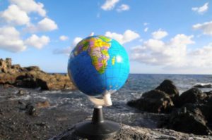
New Delhi: The world map most people have grown up seeing may not accurately reflect the true size of continents. Now, a new map projection called ‘Equal Earth’ is set to challenge that familiar picture by presenting the relative surface areas of the world’s regions more accurately.
According to the proposal, 164 countries voted in favour, while six abstained. The United States was the only country to vote against it.
Under the Equal Earth projection, Africa, Latin America, South Asia and Oceania will appear larger than they do on the traditional Mercator map. Meanwhile, Europe and North America will appear comparatively smaller.
Why Does Africa Look Smaller on Traditional Maps?
The reason goes back nearly 450 years.
In 1569, Gerardus Mercator developed a map projection that became extremely useful for maritime navigation. At a time when sailors spent months travelling across oceans, the projection made it easier to plot directions and sea routes because certain routes could be represented as straight lines.
But there was a major drawback: the projection distorted the relative sizes of landmasses.
The basic problem can be understood using an orange. The Earth is spherical, just like an orange. If you peel an orange and try to spread its skin completely flat, some areas will inevitably stretch, shrink or distort.
The same problem occurs when the spherical Earth is represented on a flat sheet of paper.
In the Mercator projection, areas farther from the equator appear increasingly enlarged. This makes regions such as Europe, North America and Greenland appear much bigger than their actual surface areas. Equatorial regions, including Africa and India, appear comparatively smaller.
Africa vs Greenland: The Classic Example
The difference is particularly striking when Africa and Greenland are compared.
In reality, Africa is roughly 14 times larger than Greenland. Yet on the traditional Mercator map, the two landmasses can appear surprisingly similar in size.
This visual distortion has shaped the way generations of people have perceived the world’s geography.
Mercator Was Useful—but Not Accurate for Comparing Areas
The Mercator projection was not designed to give a perfectly accurate picture of the relative size of continents. Its major advantage was navigation.
For sailors, being able to accurately understand directions and plot maritime routes was far more important than showing the exact surface area of every continent.
However, as maps increasingly became educational tools, the distortion created a different problem. The familiar world map could give students and the public a misleading impression of the actual size of different regions.
That has fuelled a decades-long debate over the need for a map that preserves relative land areas more accurately.
What Is the ‘Equal Earth’ Projection?
The Equal Earth projection was developed in 2018 by a team of cartographers with the aim of representing continents and countries in proportions closer to their actual surface areas.
Unlike the Mercator projection, Equal Earth is designed as an equal-area projection, meaning the relative areas of regions are preserved much more faithfully.
As a result, Africa, Latin America, South Asia and Oceania appear larger, while Europe and North America appear smaller compared with their appearance on Mercator maps.
The objective is not simply to create a different-looking world map. Supporters argue that it can help schoolchildren and the wider public develop a more accurate understanding of the actual size of different regions of the world.
164 Countries Supported the Proposal
The proposal received overwhelming support at the United Nations General Assembly, with 164 countries voting in favour. Six countries abstained, while the United States voted against it.
Togo’s Foreign Minister Robert Dussey was among those supporting the initiative. He argued that maps are more than geographical tools—they also influence education, public imagination and people’s understanding of the world.
According to supporters, repeatedly seeing regions represented as larger or smaller than they really are can create misconceptions that remain with people for years.
Why Did the US Oppose the Move?
The United States criticised the UN’s decision.
US representative Yarina Ferensvych reportedly questioned the priority being given to the issue, arguing that the United Nations is facing much more pressing global challenges.
She also questioned why the organisation was spending time discussing a map-making technique dating back to the 16th century when the world is dealing with serious contemporary problems.
Despite the US opposition, the resolution was approved by the General Assembly.
A New Way of Seeing the World?
The push for Equal Earth reflects a broader effort to make maps used in education and public communication more geographically representative.
The Mercator projection remains highly useful for specific purposes, particularly navigation, but Equal Earth offers a different perspective—one that gives greater emphasis to the actual size of continents and regions.
For future generations, the change could mean that the world map hanging in classrooms looks noticeably different—and that Africa, in particular, finally appears closer to the enormous landmass it actually is.
Share:











Indore (HO)
Bhopal
Jabalpur


©2026 Agnibaan , All Rights Reserved